
Simmetry Design
Where creativity has no limits
|
| | | J i l l i e<3's Tricks of the Trade |  |
| | | Author | Message |
|---|
Jillie<3

Posts : 23
Join date : 2017-09-09
Location : canada
| | Subject: J i l l i e<3's Tricks of the Trade 9/10/2017, 12:26 am | |
|  -Welcome to my Tutorial & Tips Compilation- -Welcome to my Tutorial & Tips Compilation-I personally believe in sharing is caring! I might not be the best artist or know everything, but I do like to share any wisdom I have with editing to people who want it. Heck, if I even help one person, I am happy! In the next post you will find both FULL Tutorials that I have made, as well as PARTIAL - or what I am calling TRICKS. The tutorials themselves are tucked away under spoilers, so you may look at the ones that you actually want! Below, you will see that I have a lovely little section of "requests". If there is something you would like to know from me simply fill out the request form and comment in THIS thread, and I shall add it to my list.   - Code:
-
Username// What program YOU use? //[Tutorial or Tip]//Request:
Happy Simming 
Last edited by Jillie<3 on 9/10/2017, 2:23 pm; edited 2 times in total | |
| | | | Jillie<3
Posts : 23
Join date : 2017-09-09
Location : canada
| | Subject: Re: J i l l i e<3's Tricks of the Trade 9/10/2017, 12:26 am | |
|   - +Click for Tutorial+:
Since most of you really wanted this one, I thought it would be best to start off on hair! The Set UpProgram |  Palette |  Brush |   *click on pictures for linksSTAGE ONE | THE BASE *click on pictures for linksSTAGE ONE | THE BASE-------------------------------------------------------- As I have mentioned before (and will mention every single time I end up talking about hair to be exact) the base is one of the most important things for creating realistic hair! Why? Because if it doesn't look like hair now, it probably won't look like hair after! If, you are unsure on what sort of direction you are wanting to go with or even better you do have an idea, please, GO GET A REFERENCE PICTURE. If I'm ever in a slump or have an idea in my head, I google hairstyles. This is gonna be your saving grace when it comes to applying texture later on. If you have an idea on light source (which a real life photo will show you) your hair is going to not only turn out better, but be a lot less work if you know what you're doing.  FIRST STEP FIRST STEP is to draw out your design. I usually use a bright colour to sketch them out, so when I'm adding my first texture layer you can see the guidelines better. I like to get as much detail is I'll need, since this is a guide on where you want your strands to go. Don't be worried if it looks a little off, you'll know once you get the blocked in colour for the base, and make changes then. After that's done, make a new layer underneath your sketch. This is where we will block in your base colour (your darkest colour on the palette) This is basically the stage in where you want to fill in and remove hair around your sims body. Whether its the shoulder, chin, ear, etc. If it is BEHIND the sim, I usually will make another layer behind my sim layer, and colour in the base. Otherwise, you could simply hightlight your sim cut out (press CTRL+Click on layer picture) and erase any base colour you do not want in front. As you can see, from the Mid picture to the Right, I have made changes to give my hair a little more character by having her ear poke out. STAGE TWO | THE TEXTURE-------------------------------------------------------- This is the stage where everything really takes shape. You really want to focus on the movement of the hair, and make sure to follow that course of action with every layer/colour. Hair isn't just a block, it will curve around the face, curve out at ends, and you want to make sure your texture lines up with that. Sometimes, in the first layer of texture, I will keep my sketch up and try and follow that line to get a base idea. BUT don't freak out if when you get to the texture part and it goes a little different. If it's looking good, go for it! Remember, you want to make a NEW LAYER with every new colour. This way, if your texture starts getting a little off or messy you don't have to worry about deleting everything and starting over.  When it comes to texture PLAN AHEAD. If you know your light sources, use that to your advantage (another great reason to have a reference) If you look at real hair, it has depth! So instead of trying to achieve that at the end with shading, you should be incorporating that idea the ENTIRE time. In this case, I have a front light source. So my LIGHTEST pieces will at the front, which means that will be where the heavier texture will go!  The rule of thumb, is the lighter palette colour, the less amount you need to put on. You already have a base texture from your previous layers, and you really want to use your lighter colours to BE your highlight. Sometimes, depending on your style of hair, you might want to change your brush to a smaller size. This way you are applying more detailed strands in the sections that will need it later. STAGE THREE | THE STRANDS------------------------------------------------------- Once you have completed your textured look, and you are happy with it, you are going to add some strands to give your hair some fly-a-ways. I'll usually start off by using the smudge tool set at either Darken or Lighten, depending on your colour, and set it a small round 1-2px size to pull the ends out. (Which apparently I did not do in my example, so enjoy my crappy little gif >_<) This will just make it not appear so blocky at the ends, since the tips of hairs are usually different lengths.   Then you will make new layer on top of your texture, and I usually grab a couple of the darkers and a couple of the lightest colours in my palette, to go around areas that should have extra detail. For example, around the ear/face, out side of the hair, and the ends. This is done with the same size brush as you would have used for the smudging just before. FINAL STAGES | THE SHADING--------------------------------------------------------- If you did most of the hard labor in the texture section this is simply a little added umphf to give your hair some depth. You don't need to go too overboard if you don't want to. Even a subtle shine is great to give it a healthy glow. The main part is to make sure you have smaller lines as well as one glow to give little extra shimmer. You can accomplish this with either Dodge/Burn tool, or using a new layer draw high lights and low lights and blur to give desire effect.  For my case, I am a dodge/burn lover <3 The biggest thing is to duplicate your million layers, and merge them down into one. Always good to have copies so you don't have to start all over if you went a little overboard. So I will start off using a large round brush to give a shine to the rounded parts of the hair. Hence around the crown line, as well as any curves in the hair that light source would bounce off of. Once I have a good glow, I will use a smaller brush to go up and down the strands of hair to give that extra bit. Usually I will make the middle brighter, and then pull away so you have that gradient on either side. For shadows, the biggest areas to hit are beside the face that would be blocking the light source, as well as sections in the hair that are covered by other pieces of hair. When applying it behind sections of hair the best course of action is to use the lasso tool, that way you will have a clean line, and it won't look messy. And voila!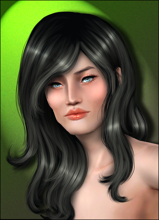
 - +Click for Tutorial:
written August 2011The biggest mistake that people can make when drawing hair, is to not plan ahead. If you know how you want the hair to look before you start drawing, it’s easier to get a natural and more realistic shape, and texture. Before I draw anything, I’m thinking on how the hair should fall. If you’re not sure how hair should look at different angles or styles, the best thing to do is study human hair. Either being your own hair in the mirror, or searching for hairstyles online. After I have an idea of what I want, or have found an image to duplicate, I always make a sketch first. Make sure to sketch out as much detail as you want, since you’ll be using this sketch as a guideline for your texture. After your sketch is done, make a new layer underneath that layer. You’re now going to block in the colour. Now make sure the colour you used to sketch is still visible over top of your base, since you’ll use it when you’re adding your texture. Now this step is a lot more important then a lot of people think. You should be able to know that it is still hair even without the texture on top. If it doesn’t look that way, then you’re not going to end up with the best results. Remember the base is the foundation of your hair, and is just as important as the texture layers. On to applying the texture. As you can imagine, your texture is going to be different depending on your shape or style. It is also, very important to keep your different texture layers consistent (following the same hair flow) or you’ll end up with a big mess. I tend to draw in less areas for the last few colours, since that will help you out with the shading stages. Apply more of the lighter colours where you know the light source will hit. It will make your shine more efficient, and give more depth to the rest of the hair. CURLY  As you can see with curly hair, there is a lot of detail you need to pay attention to, to make it look realistic. You need to map this out first, before you start drawing your texture, or your hair can turn out looking really flat. You need to focus on the curls, then if there is spots in between you can add a lighter layer of texture.  GLAM  When you’re drawing a more sleek up do, it’s important to notice breaks in the hair. It will give your picture a more interesting look. Also hair looks more interesting when it’s flowing. So don’t be afraid to give it a little more volume, or a little curl, even though you want it to be straight.  STRAIGHT  Even really straight hair has more then a boring flat design. Hair isn’t stiff like a bored, it moves. So giving some flow to your straight hair is going to liven it up. See how the top layers flow outwards giving it movement, it also means that the layers underneath will have a shadow. Also with the hair moving, the bottoms are not completely straight, even though it’s a very straight cut.  After you have your hair textures done, go back to your base layer, and grab the smudge tool (I use about 2-3px at 93%). You’re now going to add fly a ways, and pull out the tips so they don’t look blocky. If you look at the third step in one of the stages, you will see that I’ve already done that. To add more fly a ways, and give it a little more texture I start a new layer, and draw strands using a 2x brush, with the last three colours. Then change the opacity of that layer to your taste. ~~~~~~~~~~~~~~~~~~~~~~~~~~~~~~~~~~~~~~~~~~~~~~~~~ Now you’re at the finishing touches. Add your shine and shading depending on your light source. After everything is all finished, make sure you’re completely happy with the colours. If you’re not happy with your pallet don’t fret! You can always use some filters to make it more vibrant, or change the colour completely from blond to brown. I use the Color Balance tool. It’s a great way to brighten the hair up, or change the tones of the colour to match your sim better. It’s also an awesome way to fix colours. For example, if you ever draw a blond and found it way too yellow, you can add more blue in the colour balance to dull it out, and create a gorgeous blond! Brightness and contrast is also a great way to gain more depth, or dull it out. Feel free to play around with the filters, you never know what great tricks you can find out.
 - +Click for Tutorial+:
Sugarshoes9cc was wondering about where to put shine/shadows once you're finished drawing your hair, so I made this quick little guide about light source. This guideline actually revolves around shading in general, but since it's main focus was about hair, might as well just go with it being about that. I decided to start off with the basic front light source that most people tend to go with, as well as the different types (above, below, left, right). Keep in mind that I shaded extra heavy just to make sure you see what I am talking about. Pink = Highlights/Shine; Purple = Shading/Shadows Basic Light Source (Front)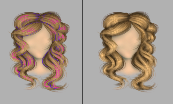 First (looking at the left image), let's talk about the shine. When you are adding it, the biggest thing to remember is the flow of the hair. Where ever there is a bend, you want to place the shine along the center. The reason being that the hair is closest to it's light source. It's a lot easier to locate this on a curly hair style because, it is an exaggerated bend. With straight hair, you have to remember to have movement in the shape. just because it's straight it doesn't mean that it's board stiff. Look at where it falls and determine if there is a bend. On curly hair, the shine/highlight will be a smaller line (use a smaller brush!). Reason, it's a smaller piece of hair that needs equal shine and shading. With that in mind, straight hair will have the shine over a larger area (use a big brush!) If that doesn't make any sense to you, think of a ball compared to a board. The ball is rounded, which needs more shading to give it's 3D appearance, while the board is flat and almost 2D. For the Shading, the biggest thing to get this correct it seeing what sections of hair are in front of the other. If you have overlapping hair, you really want to add some extra shading to give it that depth. I highly recommend using the lasso tool and select the underneath part to shade ( if you draw your shadows, make sure to erase any parts that go on to your top section). I didn't do it for my example pictures, and you can see how sloppy it looks *hides*. Also, if any body part is covering a section of hair, don't forget to shade! Example could be chin, ear, etc. (The same goes for the shadow underneath the hair, but that's more of a skin shading tut >_<) Additional Light Sources (Above, Below, Left, Right) BELOW When adding the shine you want to have a strong/bold line on the strands closest to the light source, creating a gradient the further you go up. With the curly hair you want to highlight along the bottom of the bend, and go lighter the higher you go. For shading, you want to be on top. Top of the head, sections on top of the curl. When doing below light sources, you want to focus more on the outside edges, the middle is just a light gradient to show the light cascading upwards. ABOVE Complete opposite of below (durh, right?). This time you want the shine to be on top of all the bends. With it being on top you should have a brighter image than below, I recommend just shading less rather than intense bright shine, to have better quality hair. You don't want to ruin all that work to create the texture and then just wash it all out with over dodging. The shading will be pretty simple. Keep it to only separating sections of hair, and any "underneath" hair (hair that it hiding under body parts; chin, ears) LEFT & RIGHT When you have a side light source, you want the highlight/shading to look like a gradient on both sides of hair. When I say sides of hair, I mean each side of the face. The side closest to the light source should be brighter, and bolder highlighting, that gradually turns into shading. Keeping in mind to catch creases while doing so. The other side (further away from light source) should be a softer gradient, meaning not so contrasted between the two light and dark.  Have any questions, comments, pictures you'd like to share, please post away!
 - +Click for Tutorial+:
I actually started off doing this to make a quick gif for Leesa<3 to see how I draw my braids. Which once you get the hang of it, are really easy! This braid probably only took me like 5-10min to make, so with some patience and more effort, you can make some really amazing stuff! Since there would be a lot of repetition considering most of the pictures are just more texture layers, I'll spend most of the time talking about the shape and things to look out for. I use: " />  NO this does not mean you have to have those things. But to get the same results I recommend them. STAGE | ONE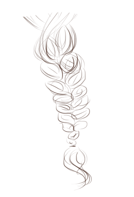 The first and probably one of the most important stages in any hair drawing, is the sketch itself. This is your master guide to help you get the texture to line up and give you the proper shape.I can't stress enough to put details/lines to where you want the hair to flow. It will give you a better idea how the sections will form, which will give your hair natural depth and shading, without all that extra work. With braids even though you would actually have three sections of hair, you can only mainly see two. But if you look, at the beginning of the braid you can actually see three sections. ( You can see it a lot better when there's texture. SO make sure you pay attention!) Most people usually draw their sketches in the same colour as the hair. Which is perfectly fine, but since you are not using it in the final picture use a colour that is easy to see when you block in the colour. Though this is a big part of the hair, don't worry if you find it a little thinner than you want it. If you're anything like me, the more layers you add the bigger this bad boy gets. Everything is not set in stone, it's all about in the moment. As you can see with mine even the flow changed a little. Always trust your judgment, and if you don't like something, FIX IT! STAGE | TWO Next, you want to start on a NEW LAYER, and place it underneath your sketch. We're now going to fill in the colour. This colour should be the darkest of your colour palet (if you choose to make one). Personally I just randomly start picking lighter colours with every new layer of texture. The reason, I'm lazy. Plus I think you can end up with some pretty awesome looking colour tones, when you go out of the box a little, but I'll get more to that later on. As you can see, this is messy, and not fully blocked in, etc. Hair isn't a thick sheet that no light can penetrate through, so I don't see the point in making this thick as can be. I find it helps later on to keep the edges not looking so flat. STAGE | THREE Now that you've blocked in your hair, with a nice dark colour, I usually grab my SMUDGE TOOL, and set it to 94-98% with the HAIR BRUSH we will use for the textures. Make sure that when you are using the smudge tool, to pull out fly-a-ways that you ALWAYS set it to either Darken, or Highlight. This will speed up the process, as well you will avoid those really ugly transparent smudges, that usually take on this weird green colour. I find DARKEN is best used to get the strands 'outside' of the hair. Meaning, where you pull away from the basic shape. For the braid, I think its important to figure out which style you are going for, to keep your look consistent. With mine, I was going for a more relaxed, loose braid. Which means, when I pull the hairs out, it's important to make the strands come out in a wide arch. When you're hair is loose the strands are a lot more visible. So you'll want to define the separation. Now if you where wanting a tight braid, you could simply keep the brush at least halfway if not more, inside the block. Which would still give you some definition around the edges, but still keep it in it's tight uniformed look. So while doing it, you would want to keep closer to the colour, rather than making that arch away, like I did in mine. STAGE | FOUR Making another NEW LAYER, pick your second darkest colour. On your first couple of layers, you don't really have to worry too much on where you're putting it, other than following the sketch of course. You pretty much want to touch base on the whole section of hair, since this way you'll still have texture showing for when you draw less with the lighter colours. STAGE | FIVE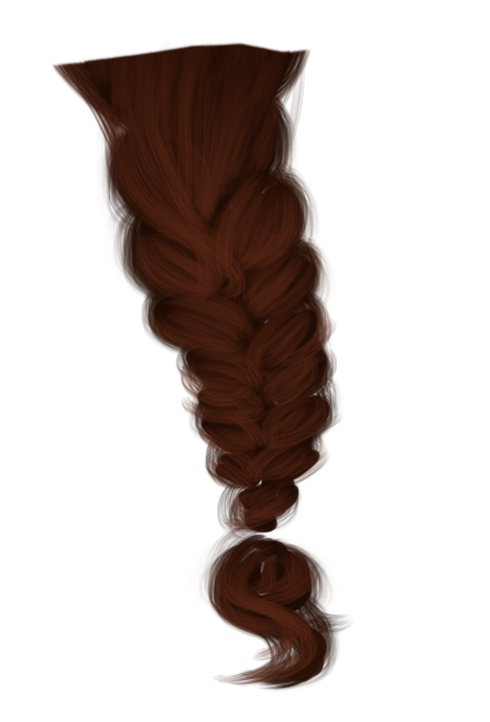  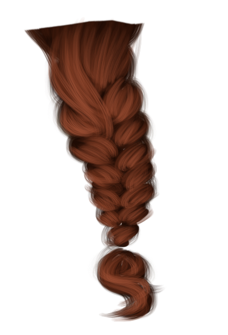 Just like your last layer of colour, you still want to draw almost everywhere so you have colour. But as you can see, I've already started to pick and choose where to place my strokes. The reason behind that is to save time and effort on the "shading" aspect. If on every layer you had the same amount of texture, you're going to lose all your depth. The best places to tell what I mean, is at the very top, near the 'seams' of the braid, and the 'tail'. When I draw the braid parts, I try to draw everything with a curved line. Normally I'll do to rounded strokes on the outsides, and then one or to semi straight in the middle. Basically 3 or 4 strokes per section of braid. If you've put on nail polish, it's the same idea. STAGE | SIX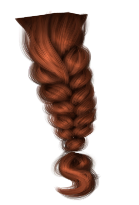  And because it's pretty, the awesome Gif. 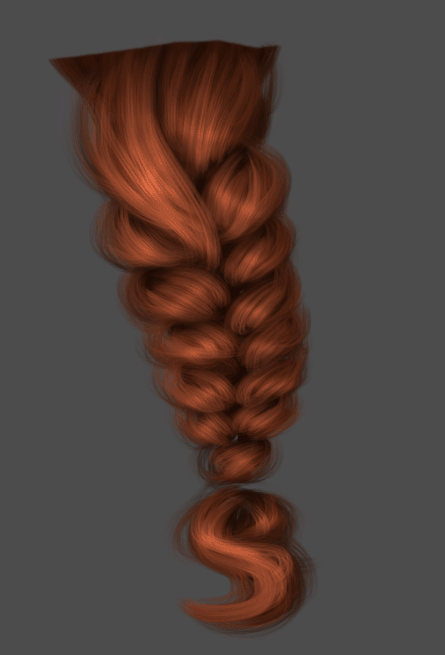
Last edited by Jillie<3 on 9/10/2017, 2:26 pm; edited 8 times in total | |
| | | | Jillie<3
Posts : 23
Join date : 2017-09-09
Location : canada
| | Subject: Re: J i l l i e<3's Tricks of the Trade 9/10/2017, 12:27 am | |
|   - +Click for Tip+:
The Setup First off you need to find a picture of the sim you want to edit. I will be using this image of Kim. You may feel free to use her for your practice, but it's way easier to use a very large picture, since the bigger the picture the smaller the detail you can do. 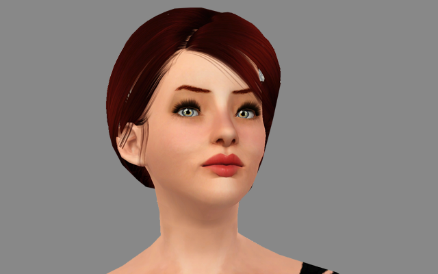 Now that she's all edited up (skin shading tutorial to come soon!) we can give her the much needed eye details! The reason I choose to leave the eye editing until after my shading is done, is that sometimes you can go a little overboard (especially if you're speeding). It's much easier to correct that mistake before you've already made it pretty. Chances of it ending up the same as it was done before, are slim to non.  Stage One In this step we're going to brighten the whites. First duplicate your layer, if you make a mistake it's much easier to just go back to the original picture rather than try and fix the one you made a mistake on. Take the dodge tool set on Highlights at about 8%. I usually use a soft brush small enough to fit just the area, as you can see below. Now don't go and make every little spec white. Use that to your advantage to not have to shade later. I normally make the stroke curve around her pupil, that will give your eye some depth and make it look round.  Stage Two We are pretty much copying the same idea as Stage One, just this time we are focusing around the iris. Once again you may duplicate your layer, if you're comfortable enough you don't have to bother. Like last time you'll be using the dodge tool set on highlight on 8%. You're going to make your brush size a little smaller to just fit inside the iris walls like below. This time you're going to curve around the pupil, but just underneath, like you're making a 'U'. 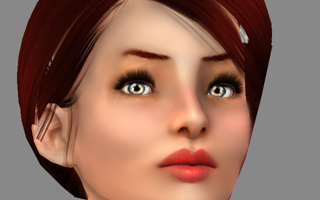 Stage Three Adding the shadow! Create a new layer (not duplicate, you need it to be a transparent layer). Grab your paint brush, use a soft brush at a 100%. You're going to draw around the top eye lid, make sure you overlap on your eye, since that's the point of this stage. 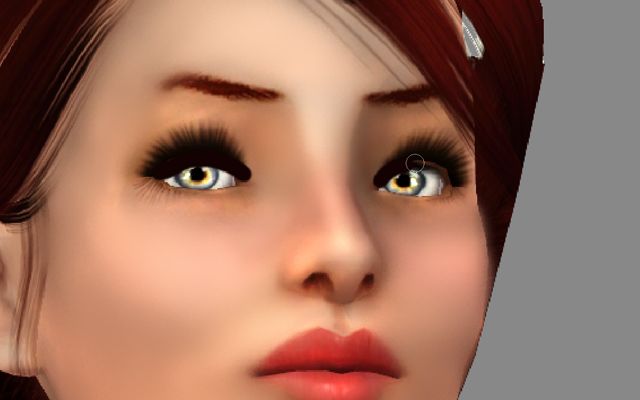 Stage Four Now that you have where your shadow is you're going to take the eraser at about 30%, big enough to create a nice gradient. Remember not to go over too much of the black, since you do want it dark at the top. If you make a mistake and erase too much, or you feel it's not dark enough for you, draw more black and use the eraser or blur tool to get your desired look.  Stage Five Adding the highlights. There are numerous ways of doing this, this is just a way I use, since it's simple and gets the point across. Make a New layer and grab your paintbrush. Use a soft brush about 1-2px big. Start off adding the dots, you want to place them on the side of the light source. So in this case it would be the left side. Using the brush at 1px I make a small line across the eye. Try to get it to curve a little (NOT like I have on the left eye >_<) it will add to it being more round appearance.   Final Stage If you notice, where I have the light source gives it the appearance as if she's almost looking up. If there is something you don't like about the picture, change it! Since everything is on different layers I'm going to move it slightly down. 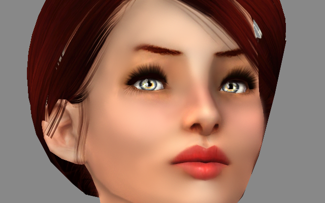 And Viola! If you have any questions or want to show off your tries PLEASE post away in this thread! I'd love to see your work with it! 
 1) I shade using the burn tool. I have it set at Highlight 10%. I use a soft brush, just big enough that over laps lash line and part of the eye where I want to add the shadow. 2) Using the dodge tool. Also set at Highlight 10% and soft brush. I dodge on either side of the iris and then make my brush small (usually 1-2px) and highlight the detail of the iris. As well as in a circle around the pupil, paying more attention to the side with the direct light source. 3) On a new layer I take my 1-2px solid brush, with pen pressure on (shape dynamics) and draw a couple of dots, usually just where the original ones are. And then I also make a quick line for glare.
Last edited by Jillie<3 on 9/10/2017, 2:33 pm; edited 2 times in total | |
| | | | Jillie<3
Posts : 23
Join date : 2017-09-09
Location : canada
| | Subject: Re: J i l l i e<3's Tricks of the Trade 9/10/2017, 12:27 am | |
| | |
| | | | Vanadis
Moderator

Posts : 447
Join date : 2016-02-26
Location : Pecans
| | Subject: Re: J i l l i e<3's Tricks of the Trade 9/10/2017, 2:04 pm | |
| Lovely stuff! Glad to see you were able to save your tutorials! | |
| | | | Mizzie
Admin

Posts : 584
Join date : 2016-02-22
| | Subject: Re: J i l l i e<3's Tricks of the Trade 4/15/2018, 1:32 pm | |
| Hey Jillie! Could you do the "Photoshopping on Clothes" request from the previous thread?  | |
| | | | Sponsored content
| | Subject: Re: J i l l i e<3's Tricks of the Trade | |
| |
| | | | | | J i l l i e<3's Tricks of the Trade | |
|
| | Permissions in this forum: | You cannot reply to topics in this forum
| |
| |
| |
|
